Saturday, June 5, 2010

Creativity is in the Air

Gilbert and Robinson, Basqiat and Dubuffet, we were bombarded with ideas about creativity this week.

Elizabeth Gilbert and Sir Ken Robinson both shared their views on creativity with us in class. Though not exactly in person, their ideas were so immersive it just drew me in.

Elizabeth Gilbert talked about externalizing creativity, attributing creativity to an entity outside oneself, allowing credit and blame to be attributed elsewhere. She talked about daemons, genii, muses as it were, where other creative people she knew would describe experiences where inspiration would come to them whether they are ready for it or not. I find this to be true of myself, doing graphical arts and having dabbled in short story writing, I would get storylines and layouts that seem perfect at the most random times, often when I cannot record it and then lose it later on when I can. I would very much like to shake my fist at this daemon character, working when he shouldn’t and slacking off when he should but then I considered the spiritual side of things as well. Gilbert talked about the origins of Olé! Olé! Olé! (at least I think that is how it is spelled) and how it came from calling out to Allah, another external source of information. As a Christian, I feel that my creativity is a fruit of the spirit, and understand that it should be nurtured, as Sir Ken Robinson discusses.

Sir Ken Robinson’s talk brought to my mind a conversation I had with someone in California about schooling. Robinson talked about nurturing creativity, and changing how schools approach these things, about how the educational system is linear, and skills are checkpoints to success. If you do everything along the way, success will be at the end and it is a straight and narrow path. The creative path is not like this. The creative path seems to weave and wind, where success could be uncovered somewhere along the way, or even thrown at you when you least expect it. He discussed how one should be made ready for this. My discussion of schooling systems with the Californian  studying Early Childhood in college looked to a revolutionary school where there is no set curriculum. Children from 5 to 18 turn up and are given total freedom on the idea that children will seek and accomplish the skills necessary for success if left to their own devices. I don’t necessarily agree with this idea but it is definitely an interesting concept.

When I first chose to be a designer, it was initially to move away from the expectations of others. I was always smart in the left-brain classes, earning top marks in mathematics and science. I was slated to be something in the more logical and analytical fields of life, but I did not want that. I wanted change. I found that area to be boring and repetitive and so sought the creative side. Graphic Design gave me an industry with income more stable than art, but a degree of flexibility with creativity. As I continued with this, I found it to be the thing I enjoyed the most, sometimes working on graphical projects for hours and hours, reaching to 5AM without even realizing. Graphic design is what I enjoy the most so it is what I choose to do. 

Sunday, May 30, 2010

I Prefer FOUR Stripes

We watched a video that looked at why people created unrealistic sculptures of the human body as well as a video from the same series looking at why people made pictures, both quite insightful.

The first video took us back to what is arguably the first statue of the human figure, a statuette known as the Venus of Willendorf, similar to many ancient venuses, the maker of the statuette chose to emphasise certain curves and body parts disregarding others. The figure had no arms or face, yet large breasts and hips. These aspects are considered markers of fertility and may have been important to the people of a simpler nature but the investigation went further.

Comparing to gulls and how chicks seek the stripe of a beak for food, research found that chicks go towards something with more stripes, indicating a want for more in the most basic, primal part of the brain. Instinct wants more.

The program continued, looking at the stylized figures in Ancient Egyptian art, moving from that to Greek art where figures moved from the Kritios Boy to a more realistic Parthenon of figures yet even in the contra-posto state, where a more relaxed stature of the figure is expressed, elements continue to be exaggerated, being the conclusion of the documentary.

The other documentary concluded that people made art, cave art, the idea of a flat image of things, coming from the trance state achieved in tribal dances. If someone had never seen or was told what a picture was, how could that someone create a picture? The main question lead an investigation into cave paintings, looking at the strange shapes and patterns found on the shapes. The video concluded that in sensory deprivation, when the eyes start making shapes of their own, these shapes would get projected onto the surroundings, leading people in caves to have their trance images to project what they’re seeing onto the walls.

Tuesday, May 11, 2010

Glaser and Gehry walk into the Opera House…

Okay, a bad start to what would probably be a bad in-house designer joke but that’s who we discussed this week in Design History.

Milton Glaser, an American Graphic designer has a few well known designs such as his Bob Dylan poster and I Love New York Logo. My first impression of Milton Glaser was, honestly, “This guy looks scary”. 

He developed his own studio and is often cited as an influence by many designers and illustrators. Glaser has stated that when working on his drawings, he prefers to work alone, as well as when he’s on a project that requires more complex thought. Glaser’s work covers a large range, his style seemingly random making it difficult to see a pattern in his works.


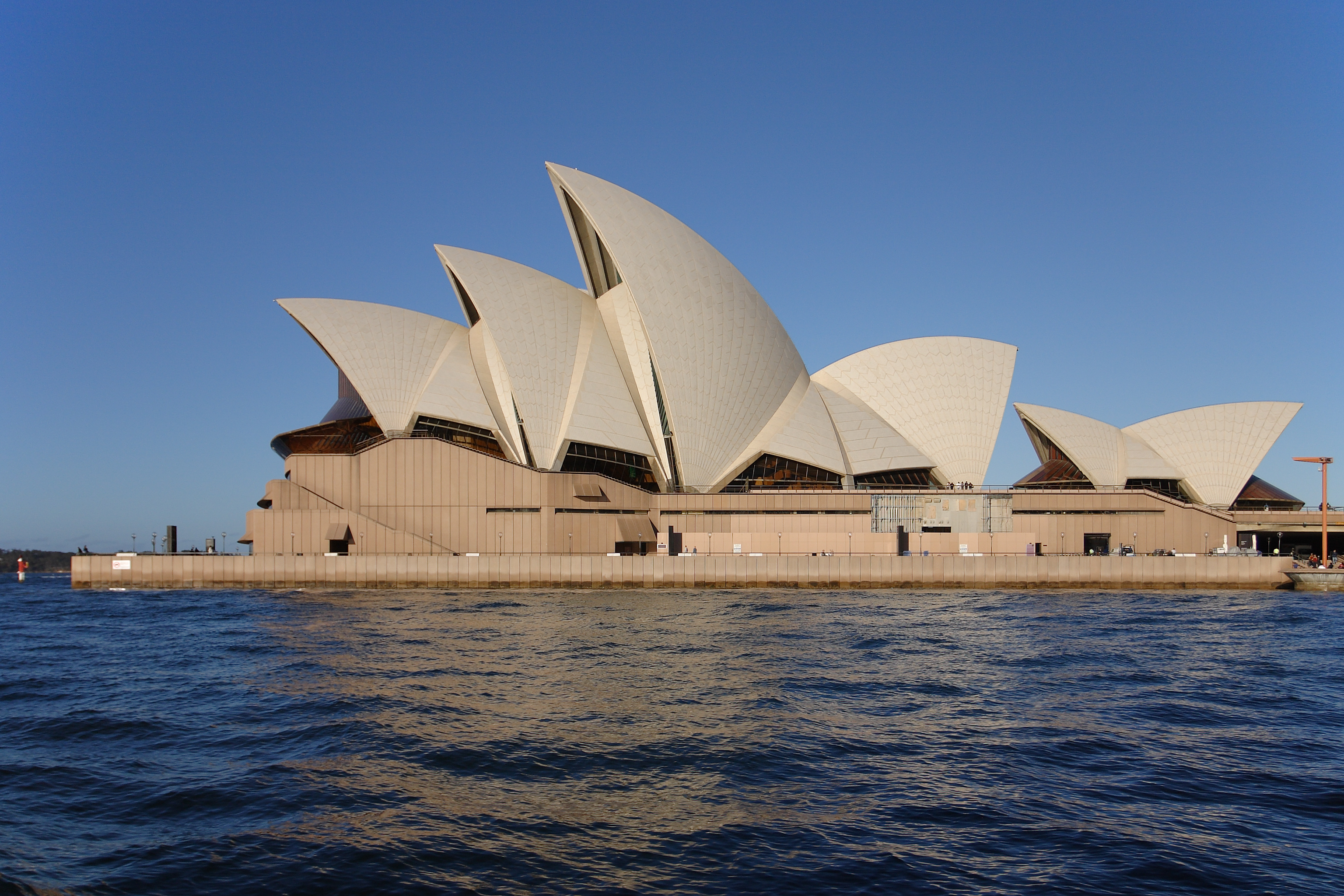
Gehry v Utzon would be a fascinating fight to see. I chose the Walt Disney Concert Hall in Los Angeles as the Gehry work I would compare to the Utzon’s Sydney Opera House considering their comparable use. Both buildings use organic shapes, moving away from the rigidity of parallel lines and rectangles commonplace in buildings, using curves in a sense echoing a visual interpretation of soundwaves. Both buildings also use these curves to generate a feel for acoustics even though the shape of the building is not actually used in the acoustics but rather overridden by internal structures designed by specialized acoustic architects. Gehry’s building (the Walt Disney Concert Hall) appears much similar to his other works such as the Guggenheim in Bilbao as well as the Jay Pritzker Pavilion in Chicago, the sense that metal has been bent and deformed giving it a crumpled paper look. The Disney Concert Hall has sails and upward points similar to the Sydney Opera House giving them another common point. The Opera House mirrors sails, giving the sense that it is an old ship docked in Sydney Harbour, a clear nod to the history of the harbour when the tall ships came with the first European settlers. Both these buildings, although housing much the same function, were built with a different intended outward sense and do this successfully, serving as icons in their respective cities.

The Jay Pritzker Pavilion


Sunday, April 4, 2010

Don't Confuse Legibility With Communication

Post war Europe gave way to the clean cut styles of Swiss Modernism. The unification of the world with the formation of the United Nations among other international endeavours as a result of the Second World War created the need for a heightened legibility in communication. The International Typographic Style, or Swiss Style, answered this need, providing clean, simple, clear typefaces expounding a new world order. Clean, legible communication served as a subversive propaganda telling post war Europe that they are moving forward beyond the chaos of war. Clean design illustrated the absence of chaos and this proved effective. Fonts like Helvetica spelled out PEACE for the 50s in Europe, a peace that continues to be held onto vehemently. 
There was this idea that a typeface should be neutral so as to not detract from the message, giving the content the responsibility to convey meaning. William Cromwell perturbed this idea of a required neutrality in typefaces as meaning should be found in content and not the font. Clear, easy and accessible became the priorities of the movement.
With every movement comes an anti-movement, each of the changes in style and design throughout history coming as a reaction to the present ethos and Post Modernism acts as the anti-movement for the Swiss Modernists. With respect to the intentions and ideals of the clean and simple styles of the Swiss Modernists, Post Modernism challenges the value of legibility in communication. 
David Carson, a well known graphic designer, emulates the ideologies of the Post Modernists, reacting against the hyper-legibility of the International Typographic Style, arguing the difference between legibility and communication. "Don't confuse legibility for Communication. Just because something’s legible doesn't mean it communicates, more importantly doesn't mean it communicates the right thing and vise versa." David Carson contends that the form in which a message takes influences as much if not more than the content in conveying its purpose. He finds the cleanliness of the modernist type to be boring, lacking in sufficient character to communicate with any effectiveness. He places a priority on the first impression a reader would make when regarding a message, first seeing the typeface before the content that is wearing the typeface. "Very fine line between simple, clean and powerful and simple, clean and boring."
Stefan Sagmeister, another designer adhering to the post modernist reaction against the simplicity of Swiss Modernism believe that both the typeface and the content together successfully communicates the message to the reader. He  presents the concept of combining the effect of the font with the message in order to entice the reader.He, along with Carson, highlights this idea of experimentation in the process of visual communication.
It is through this difference of the definitions of communication that separates the Swiss Modernists from Post Modernists like Carson and Sagmeister. While the International Typographic Style focuses on pushing content effectively, Post Modernists seek to provide an impression and feeling for the content, seeing this as more important in communication than getting the details right. In this way, they differentiate legibility with communication.

Saturday, March 20, 2010

The Medium Is the Message

Marshall McLuhan was a Canadian often considered the leading prophet of the electronic age. An educator, literary critic, philosopher and rhetorician, McLuhan is well known for his expression, "the medium is the message" in analysing and commenting on numerous examples of persuasion in contemporary pop culture. He studied the influence of communication media independent of their content.

The medium is the message relates to the influence of the mode of communication a message uses in its delivery and the perceived content. It looks at how a person views a message because of how it is presented. McLuhan's belief was that the content of the medium (Medium is the mode of communication be it television, print, etc.) did not actually matter or had little impact on society but the medium had a major effect.


Friday, March 19, 2010

Saturday, March 13, 2010

Hooray, The Butter is Gone!


Hurrah, Die Butter ist Alle! - John Heartfield (Germany 1935)


John Heartfield, an anti-Nazi German, developed photomontage to make political statements. He sought to undermine the Nazi propaganda and growing communist nationalism in Germany through his manipulation and distribution of images, often using the image of Adolf Hitler and the Swastika in a satirical manner. 

He even changed his name to Heartfield from Helmut Herzfeld to criticise the anti-British sentiment in Germany at the time.

Adolf the Superman


The Seeds of Death